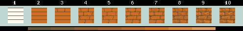
(This tutorial is best viewed in Firefox or Opera)
So: here's one way to do tilesets. Standard disclaimer: me != expert, there are many ways to do it,
please forgive any minor flaws and let me know about both major and minor ones.
A couple of things to know before we dive in: 1.) Lots of ground to cover this time, so I'll be going
fast and not-every change will have it's own image up. 2.) This tut uses CSS to provide zoomed (2x) images
(just hover over the smaller images with your mouse), so I won't be putting any 2x images up. 3.) This
tileset was done in Graphics Gale, which is what I'm using these days. Most of the techniques,
however, should still be usable in other programs.
But wait, there's more. This tileset is done in a three-quarters perspective (that's what I know it as, anyway)  where the viewer is assumed to be looking at the map from slightly above and slightly in front of the tiles. One consequence of this is that, more often than not, the player won't be able to see the faces of any walls except those facing south (you'll see what I mean, I think, soon). Another design decision made for these is more on
the programming side of things: Instead of turfs/tiles having either density = TRUE or density = FALSE, tiles
depend on directional density (my name) or turf borders (Hiead's name), where tiles have true/false flags for
the eight directions in and the eight directions out. This basically means that mobs may be able to move north, south, and east from a turf, but the code doesn't allow them to move west from that particular turf. It allows you, as the
artist/mapper, to create rooms that have smaller than full-tile walls (again, hopefully you'll see what I'm rambling about here). If your programmer (or you, if you're the programmer) doesn't know the process behind
making turf borders, she/he/you can check out Hiead, DivineOPeanut, and Shadowdarke discussing it at jtGibson's
excellent Code Snippets Database.
where the viewer is assumed to be looking at the map from slightly above and slightly in front of the tiles. One consequence of this is that, more often than not, the player won't be able to see the faces of any walls except those facing south (you'll see what I mean, I think, soon). Another design decision made for these is more on
the programming side of things: Instead of turfs/tiles having either density = TRUE or density = FALSE, tiles
depend on directional density (my name) or turf borders (Hiead's name), where tiles have true/false flags for
the eight directions in and the eight directions out. This basically means that mobs may be able to move north, south, and east from a turf, but the code doesn't allow them to move west from that particular turf. It allows you, as the
artist/mapper, to create rooms that have smaller than full-tile walls (again, hopefully you'll see what I'm rambling about here). If your programmer (or you, if you're the programmer) doesn't know the process behind
making turf borders, she/he/you can check out Hiead, DivineOPeanut, and Shadowdarke discussing it at jtGibson's
excellent Code Snippets Database.
One more note: I do a lot of cheating (from a pixel art subculture purist's perspective) and (to soapbox a bit) I want to explain why and when I consider it worth it. I use the stretch option, lots of copy pasting, etc.
and I have no problem with that, or filters, or procedural tools (like a dither brush), if they save you
time and, more importantly, if they don't make the final product look like crap. If you're working with someone and you need eight animated sprites by the weekend, damn straight you'll use any technique to get those
sprites done on time and done well. So don't be afraid to use the tools you have to get the job done well. Blah blah, enough of that.
Again,
Hover your mouse over images to see them zoomed (Doesn't work in IE)
-

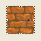
We'll make a tileset of walls and start with the original texture created here:
This technique could work with almost any texture that you've made, as far as I know. It's important that its a texture you're capable of reproducing, as you'll be recreating elements in that same style in order to make into the parts and sides of the walls.
-

Here we're squashing that texture tile down four pixels in order to make a top to the wall. If you imagine yourself above and forward of the wall (the three quarters perspective talked about above), you'd be able to see the top. You could also make room for the top by just clearing (making it white or some other color) a little off the top of the texture, but in this case, in order to make it look alright, we'd hafta remove a whole layer of stones, which would make a little too short, so I used Graphics Gale's 'handles'. They appear when you select a rectangular region and look like this:
The handles are those small rectangles that appear on the corners and the center of each of the four edges. You can use your mouse to click and hold those handles and stretch or shrink whatever rectangle is selected. In this case, we click the top center handle and squash the rectangle by moving the handle down four pixels. Keep a careful eye on the texture you're squashing as this technique will remove whole rows of pixels at a time and there are some (in this case, the dark horizontal lines, or mortar lines) that we don't want to lose. Play around with it and in most cases you can keep a good texture while making room for the top. Remember, undo is our best friend. For those who prefer MSpaint, you can use the Stretch dialog box under Stretch/Skew in the Image menu (or Ctrl+W). That'll take some experimentation, too.
-

Now, we'll begin to shade in the 'top'using a lighter color than we used originally as our base color. Since we've already established our lightsource for this texture as above it and to the right, the 'top' of the wall will have more light striking it more directly. If we use a lighter base color for the top, to the viewer it will 'read' as a different plane or a different side of what is basically a cubic shape. Notice we covered up that top horizontal dark line, that's intended since we wouldn't see that on the edge of a stone. We'll also add the vertical space between the stones just moving up from the lines already in the texture. Use the same dark color for these.
-
A.
 B.
B. C.
C. D.
D.
A.Now we'll make some chamfers, edges, whatever you wanna call 'em. It's the same process you'd use to make a 3d button. Since our lightsource is high and right we'll use the next brightest color to our top's base color to make a lighter line on the top and right edges of each stone. We'll then use the next darkest from the base to make single pixel lines on the bottom and left of the top's of the individual stones.
B.We've still got some very dark pixels left over from that horizontal line we erased in step 3 (check image at a). We'll go back over those with the base color and some colors close to it.
C.Now we'll add some texture to the top using the next lightest color to our base (the one we used in a for the top and right edges). Just add some somewhat random texture keeping the lines mainly horizontal.
D.Then we'll grab some of the colors just slightly darker than the base color of the top to blend the edges of the top with the side we're facing. You can vary the sharpness or crispness of the stones edge by using colors darker (sharper edge) or closer to the shade (softer edge) of the top. Be careful, tho, as using alot the full range of colors from the base color of the side we're facing to the base color of the top will make the edges round as if the top stones were round like cylinders.
-

This is almost an optional step. What we do here is remove some of the pixels around the lines where the stones come together. It makes the tile appear as though the stones don't exactly match up to make a perfect, smooth line, but rather have gaps where the mortar isn't quite the same size as the stones. If we don't add these, the tile will look very square against any background you put them on. In other words, there'll be very distinct straight edges on the tile and will look a lot more like a grid. They won't blend quite as well and the grid will be very visible. By removing these pixels, we'll break up the squareness of the tile and somewhat (only somewhat, because we're not taking too much off the square) soften the grid.
It's a little dicey for two reasons: 1.) We hafta remember to both make the white transparent later and to paste these over our 'floor' tiles. 2.) Sometimes the floor in front of the tile (which would appear in those white/transparent pixels on the bottom) won't be the same floor as those that would appear just past the wall (which would appear in those white/transparent pixels on the top). For instance, imagine this tile is the north wall of a house. The bottom pixels would have to allow the floorboard texture of the house's floor to show through, but just beyond the wall is the grass outside the house, so those top pixels would have to allow the grass floor texture to show through. Anyway, something to keep in mind and you can decide if you wanna skip this step. I think it adds a lot of dimension to the tiles, so I do it fairly often.
-

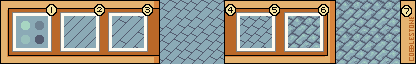
So, we've got a basic wall tile, let's start making a tileset. We could make a list here of all the tiles we need (or think we need), but more than likely you'll end up going back after trying to build your first map with the tileset and making a few more tiles that you didn't know you'd need, so, for now, we'll go with a short list. We'll need at least the northwest and northeast corner, a west and east side wall, and an alternate, plain wall tile (which I'll explaing in step 11). Go ahead and save the new wall tile here, if you haven't.
Now, use 'Save as' to save the wall tile as a new file named 'tileset' (or something). Enlarge the canvas to 96x96, set up a 32x32 grid in the new file (if you can in your program of choice), and copy/paste in two rows of the 3d flagstone tile (top and bottom). The grid will help you visiualize where the edges of your new tiles will be. I'll call these 32x32 sections of the grid tilespaces from here on out (sounds geekified, don't it?)
-

Now we'll make the east and west wall tiles. First, make sure your layer's tranparent color is set to the white we're using here. Take the top five high (by 32 wide) pixels off of the flagstone tile and rotate it 90 degrees. Place it on the middle right tilespace all the way to the edge Then place another on the middle left tilespace one pixel from the edge (you'll see why).
I should 'splain here that having the wall texture jut into what is basically going to be a tile that player sprites can move into is a design decision and one that should be regarded carefully by you and the programmer. It means that, often, on sprites that occupy a good deal of one 32x32 tile, that sprite will be drawn over this part of the wall textures. For instance, a right arm or foot will appear over the walls we're creating in this and following steps. This may not be what you wanna do, so keep that in mind. There are simpler ways of making tilesets, but what kind of boring tutorial would that be.
-

Now, we'll make the northern corners. Paste the thin sections from step 2 onto the upper left and right wall tiles (over the tiles we've got there already).
-

Fill in the white spots on those upper tiles we just pasted to match or blend into the front of our wall. We don't need those there.
-

Texture in the one pixel column on that far left edge of the left wall. I used some darker colors here, not really thinking about it, and you'll see why this didn't really work out in the long run. That, however, is maybe a good point to make here. Often you won't be able to see how the work you do on one tile will effect its ability to blend and mesh with a given tile that might end up next to it. So we'll do lots of testing with different combinations, and if we don't get it right the first time, that's fine. We'll just go back and clean the tiles up a bit.
Also notice here that we changed the top texture of the top left stone of the top left tile to make it look like a single stone again.
-
a.
 b.
b.
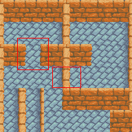
Then, we'll texture in the one pixel column on the left edge of those right 'vertical walls' (that run north south) which is the area I marked in red in image a. Use a darker color here to give the vertical wall a bit of an outline and to indicate the edge of the shadowed side of the wall (the side we can't see). You'll probably end up with some thing that looks close to image b.
-

Here's an optional step, that you don't hafta do, but that might increase both the readability of your tiles and make them look better. We can go into that top right wall and remove some of the highlights from where that 'vertical' wall would block our upper right lightsource. It's not very realistic to have a lightsource coming from above and right in what is essentially a inside space like a dungeon or house. The lightsource would more likely be a torch or lantern from somewhere within those spaces, and would be on the same level as the walls. You can definitely code and pixel for a lantrn or torchlight, but for simplicity's sake, I'm using the ol' top right lightsource since all we're trying to do here is fool the eye and brain into thinking these are 3d-ish objects and surfaces. So, in this case, making the right vertical wall cast a shadow towards the left will work.
-

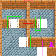
Notice, tho, those spots in the red rectangles won't really work will they? Why? Well, they look like they don't naturally connect. You can fairly easily see the cut and paste job where one tile ends and another begins (especially on the left one). Keep an eye out for this kind of thing when you have two tiles that would commonly appear next to each other on one of your maps. We'll hafta fix that left one for sure.
As for the right one, I initially put a dark (mortar) line near the bottom, right of the middle, right wall (where the two walls meet in the right rectangle). I thought it looked ok, BUT!, I hadn't thought about how many places that tile would be! Sure, it looked fine in the corner just north and next to a horizontal wall (like in the image here), but this tile also functioned as just a plain side wall that could also have a copy of itself next to it to the south (for a longer row of vertical wall, a coupla tiles long). The mortar line that looked fine in the corner looked like crap in the longer vertical walls. So, I removed it. Now, it blends a bit too much in the corner, but looks much better in the longer vertical walls. The point being: keep testing your tilesets in every combination you can and fix them when they aren't working.
I should point out here that not being able to edit pixels in larger than 32x32 sections is a weakness of the DMI editor in the case of tilesets. You really hafta be able to see how they all connect to get a smooth transition between tiles. So, if you're using the DMI editor make sure you move back and forth to the map editor often to check the results of the tiling.
-
A.
 B.
B.
In order to make the connection between the stones on the bottom right tile, we'll simply texture in a mortar line between the vertical stone (that appears to run north-south) and the top, right horizontal stone (that appears to run east-west). Easy enough. You can maybe see the difference better if you alternate looking between step 8 and image A of this step.
To make the connection on the left look more 'natural', we'll grab that little section off of top right of the bottom left tile (from the green rectangle; I also pasted it into the center just for tutorial purposes)and paste it back about one pixel to the right of where it was. Now, if we texture that area properly we'll make it look like a single stone, connecting the top of the vertical wall with the horizontal wall.
Ugh. Since we changed our basic wall tile, we'll also hafta do that for all the other instances of that tile before we do any more editing (so they'll all match up to that left vertical wall). Go ahead and paste that section carefully in all the green areas of image B.
-

Now we'll go in and on the right side of the left vertical wall and the left side of the right veritcal wall, we'll add a couple of columns of textures, just jutting out of the wall to show some irregularity and break up those strong veritcal lines the original vertical walls had on their sides. One or two pixels out here will be more than enough.
-

Now! We're gonna make an alternate tile. When you've made a good texture and tile it everywhere it just ends up looking way too regular and homogenous (this is especially true of floor tiles like grass and sand). So what can we do? We can make alternate tiles; tiles that can still seamlessly tile with the original and itself, but have a different pattern or shading. Wha? Well, lemme show you.
First, we'll take one of the regular horizontal wall textures and put it in the center. Then, being careful not to change the edges we need to tile with (in this case the right and left edges, in other cases all four edges), we 'erase' the center with one of our middle colors. From here on, it's basically remaking the texture the same way we made it the last time (but don't make an exact copy as there'd be no point then). We'll take a lighter color to do the top of the wall and put four mortar lines horizontally to match the lines in the other tiles. We'll also put some vertical mortar lines in, but being careful not to put them too close to the original tile's lines. In effect we're changing the sizes of the flagstones in this tile.
-
A.
 B.
B.
Now, we'll just texture the new alternate tile using the same methods as the original being careful not to change those outer edges too much (although stone is a pretty forgiving texture to tile with). When we're done, we'll select the new tile and move it into the bottom center tilespace and see if it'll work (B). Looks like it'll tile acceptably well. This alternate can be placed anywhere you'd place the original tile from section 1. Because it's a slightly different texture it will visually make your maps less repetitive (a very good thing). You can never have enough alternates and can make them for almost any element of a tileset. The more you make the more variation your map will have visually.
-

So...lookin' ok, I think. Next, we'll save this and then make a copy of it (you can hit save and then save as to start a new file with the same info). Next we'll add one (of many) possible floors.
So I made a cobble stone texture. It was a bit difficult to get those shorter lines to go well, so I used a 2x2 tile test to get them right (step 4). They tiled ok in the end (step 7). Pretty much the same techniques as used in the other tutorials. I want to point out here that there were two concious decisions on my part in what I thought would be best for a floor for these walls. First, the color. Cyan looks good with orange (I think), but more than that warm colors (like orange, yellow, red) have a tendency to look closer to the eye/brain when placed with cool colors (like cyan, blue, green). So, hopefully, this will make our walls stand out a bit more and increase the depth a little. Second, I used a diagonal pattern because it would stand out even more against the strong horizontals of the wall's stones. If I had done another strong horizontal pattern for the floor, the player would be hafta struggle just a little more to distinguish between wall and floor. Something we wanna avoid. Anyhoo, try it sometime with the walls: make a floor pattern with strong horizontal lines in it. It has a tendency to start washing out the walls no matter what color it is, don't it?
Notice also those, white spots on the tops and bottoms of the wall tiles are gone. All I really did to put this floor in was make 9 tiles of the cobblestone floor on one layer (you might be able to use separate files for layers if you're using MSpaint), then (making sure Graphic Gale's transparent color was set to the white from the steps above) I just pasted the tiles over the cobblestone textures. Since I saved a copy of the white background tiles, I can now use these walls with any other floor texture I can come up with using the same process.
Oh! Once we've pasted them in, we can add another shadow from that right wall onto the cobblestone floor.
-
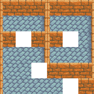
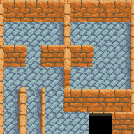
Next, we'll try the tiles we've got out by tryin ta make some rooms by enlarging the canvas even more (to 192x192) and copying and pasting the tiles into some room-like shapes (a 32x32 grid helps again here, if your program can do one). It turns out, we're kinda missing some tiles, huh (they're the 'blank' white spaces)?
-
In green, we'll need some tiles to end the wall. If we do it right, these can also serve as tiles for outside corners (like in the lowest of the three green boxes). In red: Bleh. Those walls up against each other look like crap. This was a design error on my part when I started and could have been avoided if I had planned it out more. I left this mistake in (well, besides the fact I'm a bit lazy) so you'd know that you can always correct a crap tile if you find it. And, you find it by testing them out. Anyway, we'll hafta blend those two rows together into a single set of stones. Highlighted in purple is a common problem with 3/4 perpsective tiling. Unless you're using two tile mobs/sprites that are programmed to be layered above the wall tiles (like the goofy looking purple guy there), you won't get a visible sprite in that corridor (even tho it looks like you could). So, you'll need at least a row of (non-dense) floor space for a sprite to walk down there.
-
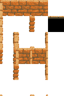
We'll fill those outlines with some texture, making sure we get the highlights right. Second, we blended the two sides of the vertical walls (got rid of the darker lines) so now the two tiles against each other look like one line of single stones. Also notice we've got some new tiles in the lower left. These are a kind of passage way only one tile wide, which we can do in the system we're using.
-
Put the floor tiles in under the new tiles. Not bad. We've got a single tile 'doorway' and a couple of end elements that also serve as outside corners.
-
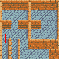
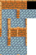
So on the left red rectangle we've got that single tile passage way going north-south (the left rectangle), but we'll need a single tile passage way going east-west (the right rectangle).
-
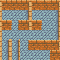
We'll also need some capstones for when those vertical walls end out in the middle of something. So we'll make a pair of small corners at the red rectangle. We'll take those capstones and place them any time a vertical wall ends out in the middle of the floor (otherwise, those ends will look really obviously square and tiled). The nice thing is, we'll also use them to create that part of that east west passage way.
-
A.
 B.
B.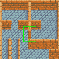
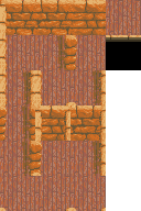
Go ahead and erase the two tilespaces where we'll make the east-west passage (image A). Then, paste the corner elements we made in step 3 on the end of that wall next to one another (the green rectangle in image B).
-
A.
 B.
B.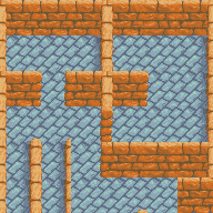
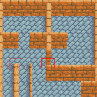
We'll then take little ending tiles (the red rectangle on the left in image A) and paste them over the end pieces we just placed (at the red rectangle on the right in image A). But wait!
We'll need to make them transarent first or we'll just screw up the last step, so we'll paste them over in the lower middle of the tileset (because we've only got repeats of the floor pattern there and won't be drawing over anything we need) as shown in image B.
-
We'll make a rectangle around the parts we need and set that color to be transparent. We can then copy only the stone (which we want to move) from that rectangular area (which we don't want).
-
Now we've got a east west passageway!
-
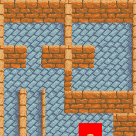
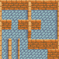
Let's do a larger test:
The black is the void tile. A pretty common technique in DM (I think?) is to create a turf with opacity = FALSE and density = FALSE (so you can't move or see through it) and set it to the default turf (world.turf = /turf/void). I usually make my void turf pure black.
So: Hmm...it all looks ok, but...we're missing one more tile to make it look complete.
-
Something to blend into that blackey blackness of the void tile. We'll make a couple of new colors between black and our darkest orange (the mortar line color). We'll copy the top of the bricks in the standard tile and move them to the top of the new tile and then blend that into the black with our new colors (you could also dither/texture these instead of straight lines). Here's the result with the new void transfer tile:
 Well, I think that might do for now. I'm sure they'll be more tiles needed as the mapper (or you) try to build more of a map and different junctions of passages and room shapes come up. Also, you could easily add some wooden doors that open and close, torches that flicker, and sewer grates and broken stones all over. At least you won't be bored. :)
-
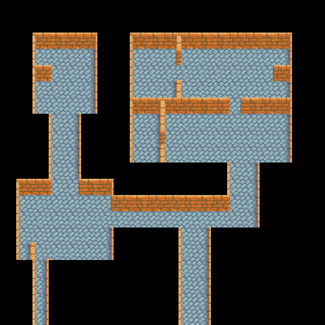
Here's the tileset in blank form, with the cobblestone floor, and with a wooden plank floor I wanted to try out (although I'm none too happy with that texture). To import these tiles into DM you can save the pic to your computer, go into the DM icon editor, and, after creating a new icon, use the Pixmap-Import... menu command to load the file. DM will split it automatically into 32x32 tiles. You will hafta make a dm turf definition file to play around with them in the DM map editor, tho.
Currently the tiles in the set are (left-to-right and top-to-bottom (skipping the far right row):
- Northern & Western Walls
- Northern Wall
- Northern Wall Alternate
- Western Wall
- Northeastern End / Corner
- Northwestern End / Corner
- Western & Eastern Walls
- Western Wall & Southeastern End
- Southwestern End & Eastern Wall
- Northwestern & Northeastern Ends
- Nothern Dead End
- Northern & Eastern Walls
- Eastern Passageway
- Western Passageway
- Eastern Wall
- Southwestern End
- Southeastern End
- Southwestern & Southeastern Ends
Oh, and hey! If you end up using the ideas here to try some tiles, post them to the Pixel Art Society (the links at the beginning and end of this page). I'd love to see them!